
EXTERNAL MARKETING PLAN CASE STUDY
Hard Work AND Heart Work:
Building a Real Estate Brand from the Ground Up
From wine industry pro to lifestyle-focused realtor: how we built Deanna a complete brand, voice, and website, in a way that’s unmistakably her.
Deanna serves the greater Denver metro area, with a special love for the western communities where the plains meet the Rockies: Lakewood, Golden, Arvada, Wheat Ridge, and beyond. Her mission is to make homeownership feel accessible and possible by matching properties to lifestyles, not just numbers.
Deanna came to real estate the way the best agents do: with a whole life of relevant experience to help her clients. After a successful career in wine industry sales (including luxury markets and high-level clients), 17 years of living all over Colorado, and a personal real estate history that included buying her first home right before the 2008 crisis and selling mid-crisis, Deanna had earned a perspective most new agents simply don’t have.
But she was starting her real estate brand from scratch. No logo, no website, no messaging, no digital presence.
And she was clear about one thing from our very first call: “I want a brand that feels unique to me, that focuses on who I am and attracts those I serve in a really unique way.”
She didn’t want the glossy, interchangeable look of a thousand other agent websites. She wanted something classic and timeless that could serve her first-time homebuyers today and grow with her toward her long-term vision of luxury, land, and live water properties.
The Challenge
Building a complete brand and digital presence from scratch, for a talented agent
This sprint covered the full stack: brand strategy and messaging, visual identity, website design and copywriting, lead capture, and an SEO foundation. The real challenge, though, was strategic.
Deanna is new to real estate, which means we needed to showcase her credibility and talent in a unique way. Her realistic near-term clients are first-time buyers, but her aspirational market is luxury properties, two audiences that usually get very different brands. And as a new agent, the traditional real-estate website formula (hello, Properties page) wouldn’t work to get her message across. Every one of those tensions needed a thoughtful answer, not a template.
Why Deanna Chose Aligned
A partner who could translate a one-of-a-kind personality into a complete, strategic brand system.
Deanna didn’t need someone to hand her a logo. She needed a partner who would listen closely enough to build a brand around who she actually is: the heartfelt hospitality, the wine expertise, the trail-hiking and paddleboarding Colorado life, the hard-won real estate wisdom.
Aligned Marketing’s sprint approach gave her all of it under one roof: strategy, messaging, visual identity, copywriting, and a website, all built in sequence so every piece reinforced the others. No juggling a separate designer, copywriter, and web developer. Just one team holding the whole vision.
The Process

Part One: Discovery That Digs Deep
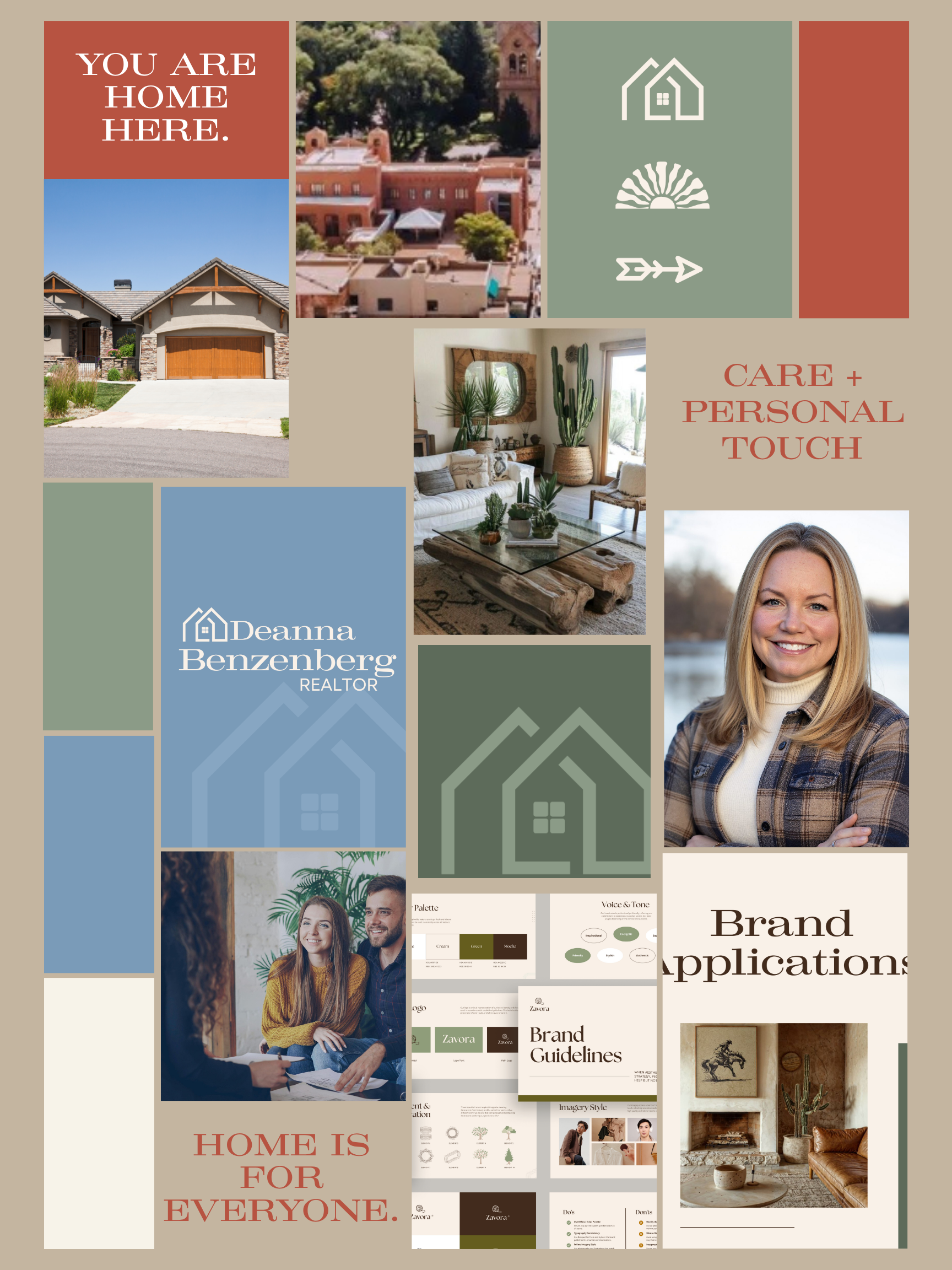
We kicked off with a discovery deep dive into Deanna’s business focus, ideal clients, values, and vision, plus a mood board full of warm, earthy, western imagery.
Then we did something that set the tone for the whole project: we organized every note into a clean Brand Discovery document with all of Deanna’s direct quotes preserved.
Her own words became our source material, because a brand that’s ”unique to me” has to start with, well, her.
Part Two: Messaging First, Always (and a Client Who Handed Us Gold)
Before a single pixel was designed, we drafted a comprehensive Messaging Guide: brand identity, mission, audiences, voice pillars, and language guidelines.
Then came our favorite moment of the project; gathering feedback! She also shared a phrase that had just spoken to her: “putting in the hard work AND the heart work.” We didn’t just nod politely. This statement became brand through-line (“there’s no single ‘best’ home, just like there’s no single ’best’ wine”), preference-matching became a named competency (“The Art of Lifestyle Matching”), and Hard Work AND Heart Work became a voice pillar that now lives in her tagline.
Part Three: A Visual Identity Rooted in Place
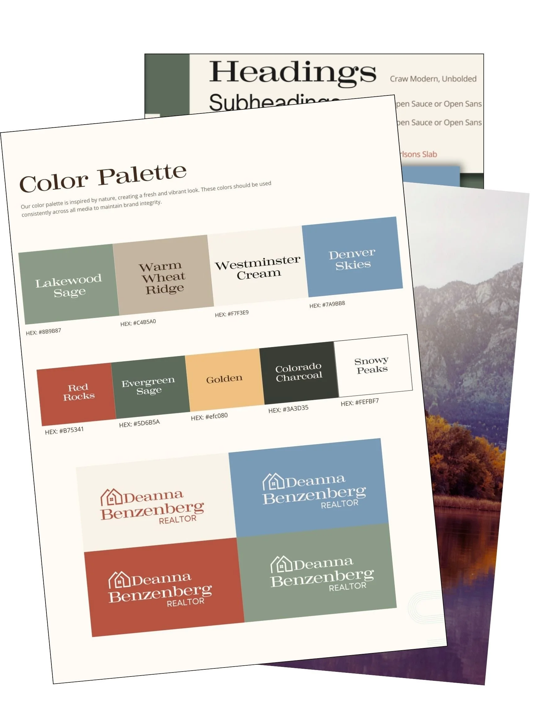
The visuals were grounded in Deanna’s actual Colorado life. We developed a color palette with place-named colors (Lakewood Sage, Red Rocks, Golden, Denver Skies, Snowy Peaks), paired a classic serif with a clean sans-serif for that timeless-but-not-stuffy feel, and explored logo concepts through a “Geometric Homecoming” design philosophy: homes that belong within their landscape rather than imposed upon it.
After thoughtful iteration, we landed on a geometric line-art house symbol and wordmark, supported by an icon collection (a house, a sunrise, an arrow) that speaks to Deanna’s ability to shine a light on what her clients really want and point them in the right direction.
Part Four: Copy That Solves Problems, Not Just Fills Pages
Full website copywriting followed the messaging guide. When we realized locals don’t actually say “Denver West,” we systematically revised the copy to lead with “Denver metro” and “the western communities where the plains meet the Rockies,” because authentic local language beats a marketing construct every time.
And when a traditional Properties page proved impossible for an agent with no listings yet, we replaced it entirely with a Resources and How-to-Buy page: buying process education, myth-busting, lifestyle-organized neighborhood guides, and first-time buyer tools.
It positions Deanna as a trusted advisor and directly delivers on her brand promise of making homeownership feel accessible. We wrapped the phase with a structured client review, complete with a video walkthrough and a clear “here’s what to look at (and what not to worry about yet)” framework.
The Results
A full brand identity, delivered: a comprehensive Messaging Guide, a place-inspired visual identity, a complete logo system, and a Brand Guide with application rules to keep everything consistent for years to come.
And maybe most importantly: a brand that is unmistakably, quotably her. Her wine expertise, her Midwest work ethic, her Colorado adventures, and her own words, elevated into a system she can grow with. That was the assignment, and it’s the part we’re proudest of.
Deanna’s place-named color palette and classic typography system, designed to feel timeless in year one and year ten.
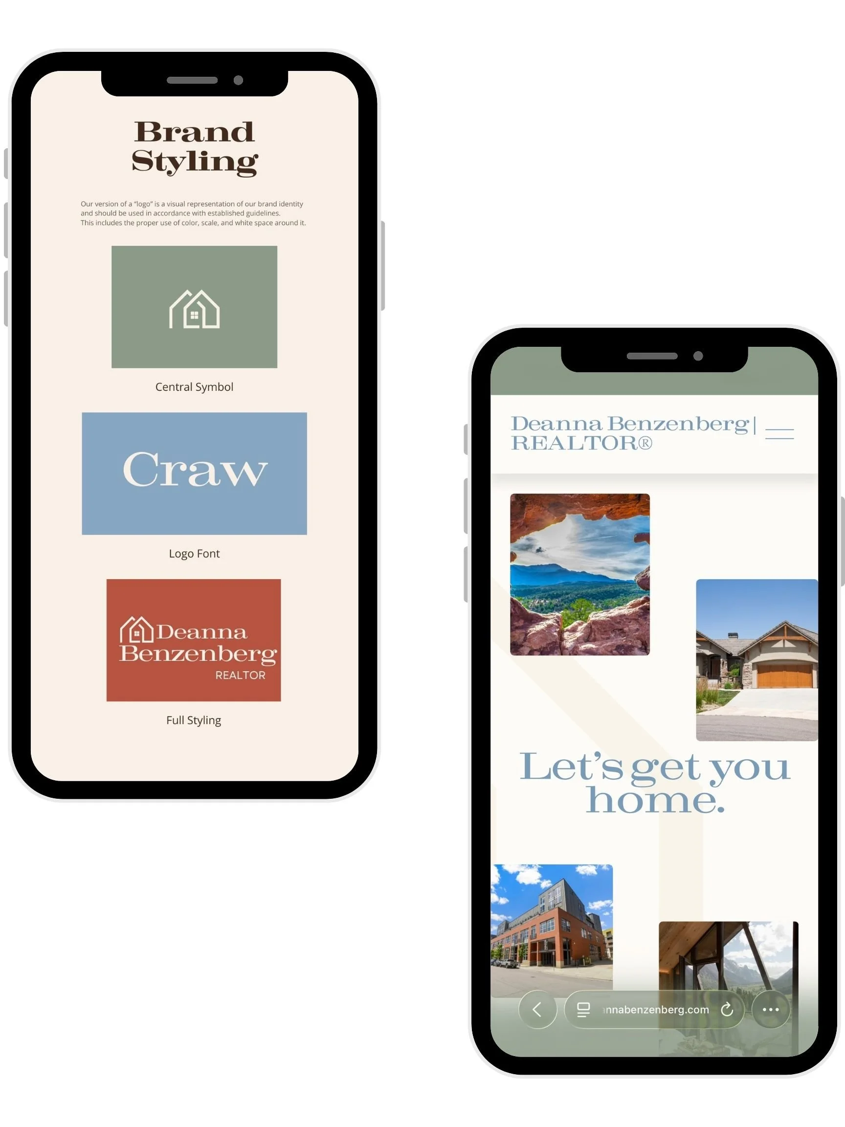
The final logo system, born from our “Geometric Homecoming” design exploration: a home that belongs within its landscape.
Lifestyle-first copywriting and an education-focused Resources page that positions Deanna as a trusted advisor from day one.